Joshua Paling
The Problem
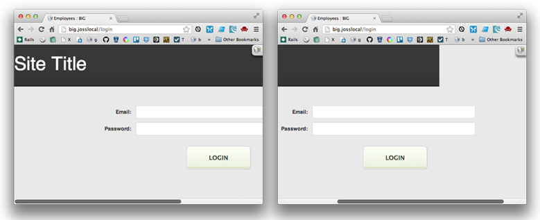
Sometimes when your window is narrow, you’ll find that your fixed-width header or content appears to get truncated when you scroll to the right.
The Solution
Add a CSS rule to ensure that your body element is at least as wide as the fixed-width area of your site. Something like:
body {
    min-width: 980px;
}
What’s happening Here?
Lets say the fixed-width area of your site is 980px, but your window has been resized to 400px.
By default, your body element will be the width of the window – ie, 400px. And if a block element doesn’t have a specified width, it will default to the width of it’s container.
So in this case, the black background has been applied to a div which is a child of the body element, meaning it has a default width of 400px.
Of course, when you scroll over to the right, you’re scrolling past that 400px mark, and therefore scrolling beyond the width div with the black background. This is what makes it appear as though your content is truncated.
By specifying a min-width on your body, the body element (and therefore it’s children without explicit widths) will always be at least as wide as you need it to be, no matter how small you resize the window.